The Dashboard Designer UI includes the following panels:
| Span | ||
|---|---|---|
| ||
| Available Content: from this panel, you can drag content onto the Dashboard Canvas. This panel includes the following sections: |
| Span | ||
|---|---|---|
| ||
| New Content: lists the content elements you can create for your dashboard. |
| Span | ||
|---|---|---|
| ||
| Existing Content: lists the Ad Hoc views and reports you can access from the Repository. |
| Span | ||
|---|---|---|
| ||
| Filters: lists all filters associated with any resource added to the dashboard. |
| Span | ||
|---|---|---|
| ||
| Dashboard Canvas: this is where you create and edit your dashboard. It includes the following sections: |
...
| Span | ||
|---|---|---|
| ||
| Title Bar: displays the name of the dashboard (in the figure above, the name is "New Dashboard"). |
| Span | ||
|---|---|---|
| ||
| Toolbar Buttons: see table below for details. |
| Span | ||
|---|---|---|
| ||
| Main Creation Area: build your dashboard. Drag elements from the Available Content panel here to get started. |
Icon | Name | Description |
|---|---|---|
| Preview | Click to display current dashboard as viewed by the end user. |
| Save/Save As | Hover cursor over icon to open a menu of save options. |
| Undo | Click to undo the most recent action. |
| Redo | Click to redo the most recent undone action. |
| Undo All | Click to revert the dashboard to the most recently saved state. |
| Parameter Mapping | Click to open the Parameter Mapping dialog. See Parameter Mapping for more information. |
| Dashboard Properties | Click to open the Dashboard Properties box. See Dashboard Properties for more information. |
| Show/Hide Grid | Click to display or hide a grid. |
| Show/Hide Filter Dashlet Pop-up | Click to display or hide a filter pop-up window. This button only appears when you enable filter dashlet pop-ups in Dashboard Properties. |
...
| Span | ||
|---|---|---|
| ||
| Chart: Allows you to create a chart within the Dashboard Designer. |
| Span | ||
|---|---|---|
| ||
| Crosstab: Allows you to create a crosstab within the Dashboard Designer. |
| Span | ||
|---|---|---|
| ||
| Table: Allows you to create a table within the Dashboard Designer. |
| Span | ||
|---|---|---|
| ||
| Text: A free-form text entry field. Resizing this type of item changes the size of the font in the Label. Use free text items to add titles and instructional text to the dashboard. |
| Span | ||
|---|---|---|
| ||
| Web Page: Any URL-addressable web content. The dashboard can point to web content and include it in a frame in a web page. For example, you might include a frame that points to the logo on your corporate website; when that logo changes, the dashboard automatically updates to reflect the branding change. |
Existing Content:
| Span | ||
|---|---|---|
| ||
| Reports and Ad Hoc views accessible to you. |
Filters:
| Span | ||
|---|---|---|
| ||
| If a report you include on the dashboard is designed to use input controls or filters, you can add that capability to the dashboard. The server maps input controls to one or more frames. For example, if multiple reports include the same parameter, the server automatically maps the corresponding control to each of those reports when you add the input control to the dashboard. Controls can also be manually mapped to custom URL frames. |
In addition to the main element, your dashlet may contain the Maximize icon  depending on how the dashlet properties are set. Click this icon to open the dashlet as a larger view.
is the Lambda Zoola™ interface for creating and editing Dashboards. Using the Dashboard Designer, you can select Ad Hoc Views, Reports, and Filters to include in your Dashboard, and control the formatting and layout of your Dashlets for exporting and presentation purposes.
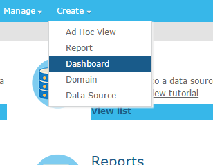
You can open the Dashboard Designer in two distinct ways: